Using existing images
from the internet, use Photoshop to create
1x mock up of a front
cover,
1x contents page
1x double page spread.
  |
Thursday, 1 October 2015
Google mock up ideas
Double Page Spread House Styles
Look at 3 double page spreads from the same magazine (different issues)
and explain how images and text (fonts and sizes) are used to create a house
style.
I have chosen to look at a variety of different double page spreads from hip hop and r&b music magazines to give me some inspiration for when I am designing and creating my own. This will help me to have an aspect of verisimilitude in my magazine as it will hopefully fit in with other similar magazines and also show how I have taken the time to gather research and evidence to back up my decisions.
Through the existing pages I have collected, I have discovered that a large, main image is used generally on the left page. This helps show the main feature of the article and also makes the double page spread more interesting as too much text can be over powering. This is also the reason large, eye catching title and subtitles are used, to keep the article interesting throughout.


Contents Page House Styles
Look at 3 contents pages from the same magazine (different issues) and
explain how images and text (fonts, and sizes) are used to create a
‘convention/house style’ for that product


These are all different contents pages which I have found in multiple editions of XXL magazine. A house style is created by using similar conventions which make each contents page look similar and recognisable. The style of images are all very similar, with the main ones avoiding coloured backgrounds.
Throughout, you can see that a large image is used to show the main feature and smaller images are used all around to keep the page interesting and to show the other stories featured in the magazine.
Colour Scheme ideas, Name ideas and Feature Story ideas
Colour scheme choices

I like this colour scheme because all of the colours are bold and stand out. These colours are the same colours used by Rolling Stone magazine which could be a problem as my magazine follows a hip hop/R&B genre and Rolling Stone correlates more with the rock genre.

I like this colour scheme because the colours compliment each other and the fuchsia and the gold are frequently associated with R&B music, however, the pink may not be associated as much with hip hop which is what most of my feature stories are about.

I like this colour scheme because it is similar to the first one but it uses a dark pink/purple instead of the red, adding a more original look but still standing out and complementary colours. The pink used in this may also take the attention off the hip hop genre which is the only thing I don't like in this colour scheme.

I like this colour scheme because all of the colours are complimentary and all go well together. I don't think this would be a good colour scheme for a R&B/hip hop music magazine because the colours are too bright. I also used this colour scheme for my college magazine which would also show that it may not be the right choice.

I like this colour scheme because the black, white and yellow/gold are all colours frequently used in my chosen genre making them a good selection of colours for my magazine, the gold also stands out and is eye catching making it a good colour scheme. The only problem with this is that it is a little boring because it only uses one main colour.
i like this name for my magazine because it originates from one of the greatest hip hop artists of all time. It is associated with Biggie Smalls who is a hip hop legend and my target audience will recognise this, showing the link from Notorious to a hip hop music magazine. Hip hop has always been seen as a genre with a lot of bravado and an outlook on society which people may not be able to reach, making it as popular as it is. It pushes boundaries making it notorious throughout the genres. I think it would make a good name for my magazine because of these factors.
Potential cover stories
|
Mise-en-scene, Location and Prop ideas
| -Show a variety of images
and locations you would like to shoot your magazine, show where you may have
got this inspiration from and why you feel it will appeal to you audience. |
Location
I have found a location which I think I will be using for my front cover to be shot in. The location is slightly run down and has a lot of graffiti which I believe reflects my genre in the best possible way. As I am focusing on hip-hop and r&b, there is a lot of iconic features which I feel I should involve in my images to make it more realistic. Many artists in these genres come from families who may be on low income meaning they could have possibly spent more time on the streets rather than in their homes. These artists and listeners are also frequently from African American backgrounds, and stereotypically have more knowledge about street life than maybe white people. The area I have found has many garages and lots of graffiti and I think it will make a good location for the cover of my magazine.
I found inspiration from this photograph because it is a simple image from a low angle. I like this image because it is easy to craft but is also so effective. I think that the outfits and the poses of the artists help represent the genre without even having to show anything specific.


Costume Designs
Create
3 costume looks for your artist that really demonstrates the genre of your
magazine. Explain why you have chosen these outfits and explain why it will
appeal to your target audience.
to create the perfect costume for my artist, I have decided to look at the fashion sense of famous hip hop and R&B icons who are very influential in the culture. This will help to show how my artist fits into my genre and appeal to the audience because there is already a sense of style within the genre which is what I will aim to create.
I have focused on the fashion worn by many influential people and artists such as Rihanna, FKA twigs, Cara Delevigne, Kylie Jenner, Miley Cyrus, Rita Ora and Beyonce. I decided to look at the modern street style, grunge and 90's hip hop. This gave me a wide view of the fashion choices available and helped me narrow it down to three final style choices for the outfit style for my artist.

Social Class & Demographic of my Product
To state
which social class you will be aiming your magazine at.
-To state
how you will adhere to their needs
-To decide
on the price of the magazine
-Understand
what free gifts/ prizes they would like
-How the
social class table will help you with your feature stories and target
audience.
social class According to the results from my survey, the majority of my audience are from a household with a medium to high income meaning my magazine will be aimed mostly the middle class. adhere needs deciding the price free gifts/prizes The results i gathered from the survey I carried out I discovered that fashion vouchers and free music events were very popular as a preferred prize. social class influences on feature stories |
Style/Iconography of my Product
-Create a video/mood
board/sketches of the style your magazine will take. Look on pintrest to
gather ideas related to the genre/style of your genre and some stylistic
elements you want to create. E.g.
-Font mood board
-Images you like the
style of
-Album work of existing
artists
-Existing front magazines
you find inspirational/like the style of.
-Imagery you find
interesting
-Posters/ artwork from
existing bands in your genre.
-Themes you think your
audience would be interested in etc.

I created this table to help me analyse and evaluate different type faces and the connotations they portray. I then looked at the websites www.dafont.com and www.1001fonts.com to offer a wider range of fonts to choose from for my mast head. I decided to do this because there is a lot more fonts to choose from, meaning that the font I choose for my masthead will be more original and differentiate from other music magazines.

I like this font for my masthead because it is a simple design and stands out. The typeface is a serif style and I think this gives it a classic look. I think this font may look a bit general which is the only problem with it.

This is a decorative font and I like it because it creates drama. I don't think it would be good for my magazine because my genre is hip hop/R&B and this font looks similar to the font used by The Sex Pistols which fit more into the rock genre, meaning it could be misleading.

This font is a sans serif font. it is bold and stands out which is why is would make a good mast head. This font is also similar to the font used on American college varsity merchandise which is also good because a lot of the music in my genre/s originates from America.

I like this font because it a mix between a sans serif font and a decorative font. It is original and interesting setting it aside from other fonts used. I think the only problem is that is may be too decorative to be known as a respectable music magazine.

This font is also both decorative and sans serif. I like this because it is eye catching and interesting making it a good font for a mast head. I think this font would look better with a magazine about dance music because it is similar to some already used in that genre.

I like this font because it is a serif font with some decorative aspects with some of the letters being smaller. This font is similar to the first one I found but is just more creative which is why I like it.

This font is a decorative typeface which draws attention to it straight away. This typeface could come across as too childish which may be a problem because my magazine is aimed at an older group of people who like the genre of music my magazine is based upon.

I like this font because it is both decorative and sans serif but has a mature appeal to it. I also thinks the 'O's look a little like records which is relevant because the music I am focusing on originated on records and tapes.
  |
My Reader Profile
I created a survey (https://www.surveymonkey.com/r/ZL9VJ33) to help me construct my own reader profile. My survey consists of 10 questions which would help determine who my average reader is. I used 3 psychographic questions based on age, gender and income which make the physical features of my reader clear. for the other 7 questions, I created demographic questions based on likes and dislikes of the reader, but also on what would appeal to them most in a music magazine. For example, one question asked what the reader would rather win (technology, live music events or fashion vouchers) and the answers to the question with the highest percentage will give me an idea of what appeals more to my audience and therefore what I should offer as a prize inside the magazine.
I emailed my survey to the whole class to get responses to help create my reader profile. From this I learned that my results weren't as accurate as they could be as I found all of the respondents under 18. to fix this problem, I posted my survey on my twitter profile which opened up my survey to a larger sample of people, and therefore made my results a lot more accurate. I am glad I did this because before I had 9 responses but afterwards I managed to reach almost 40 responses.
To help present my results in a creative manner, I found the website 'GoAnimate'. I transferred all of my data across to create a video showing my results in an interesting way. ( https://goanimate.com/videos/0qIQOLrQwri4?utm_source=linkshare&utm_medium=linkshare&utm_campaign=usercontent ) The only problem I found with this website was that the video has a constant watermark across it because I only got a free trial, which also meant that I couldn't embed the video so I had to just post the link instead.
Reader Profile Research
  I looked at an existing reader profile for the magazine XXL. XXL have an editorial mission which is to take a mature and intelligent approach to hip hop, with an emphasis on the music and lifestyle that are at the heart and soul of the culture. The magazine keeps up with the pace of hip-hop's dynamic energy and targets the trendsetter who lives for urban music. As the culture continues to evolve, XXL is there to deliver the most progressive view of the music and the culture surrounding it. I looked at an existing reader profile for the magazine XXL. XXL have an editorial mission which is to take a mature and intelligent approach to hip hop, with an emphasis on the music and lifestyle that are at the heart and soul of the culture. The magazine keeps up with the pace of hip-hop's dynamic energy and targets the trendsetter who lives for urban music. As the culture continues to evolve, XXL is there to deliver the most progressive view of the music and the culture surrounding it.
XXL magazine attracts 78% men and 22% women, readers have an average age of 29 and the majority of readers belong to the African-American ethnicity. As most of the readers are African-American males which mainly have an interest in hip-hop and are associated with the culture. This makes the magazine desirable because they want to keep up with the latest music, trends and news regarding hip-hop and this is shown through the magazine, making people want to buy it.
My reader will be similar to the reader of XXL magazine but they also like R&B music, meaning that there will be a more even ratio of men to women and a younger average age of around 24. The purpose of a reader profile is to show the specific details of the reader, making it easier to aim the magazine at a specific group of people. A reader profile will help to sell my product because it makes it easier to direct the magazine to a certain target market meaning that the information will be more of what they are interested in so more people will be attracted the magazine, and buy it. |
Genre Research
|
Summary of Conventions
A summary of key words that are conventionally featured on a FC, CP
& DPS of a music magazine. Please present in a creative manner.
When analysing the conventions of a front cover, a contents page and a double page spread, I decided it was best to use 3 different magazines to compare which conventions appear more commonly. I did this because I couldn't decide which genre of magazine to focus on so I thought it was a better idea to look at different magazines to help influence my final decision. I used a 'Rolling Stone' magazine cover because it is a generic, well known music magazine which doesn't just focus on one genre of music. For the contents page I decided to analyse an 'NME' page because it is an indie magazine which is also very popular and regularly features very famous artists. For the double page spread I analysed 'Billboard' magazine as it also focuses on more than one genre of music.
I think doing this was effective because it has helped me have a clearer image of what I want my magazine to be like. I have decided not to focus on indie music like NME, but to have a more compatible magazine which could feature more than one genre of music like Rolling Stone or Billboard.
Front Cover
Masthead - The masthead is always at the top of the cover and it usually is a large, bold font which is recognisable. The masthead must be an individual font and style because it is what makes the magazine stand out from other magazines. Rolling Stone magazine is known by many people and the masthead is iconic. The style of the writing shows the reader the magazine's place in the music industry. The main image is covering the masthead which is a convention regularly seen in music magazines.
Font Size & Text - Different fonts and text sizes are used on the cover to make it appear more interesting. If all of the text was the same size and font then the cover could look more boring as it is very repetitive. The more interesting stories on the cover will also be bigger because the bigger the text, the more visible it is.
Plug - A plug is sued on the cover to draw the attention of the reader. It is usually in a separate box to make it seem different from the feature stories. The plug is usually something engaging such as an exclusive interview or a competition etc. In this cover the plug is advertising a 'special report' which a reader would be intrigued about and hopefully buy the magazine.
Feature Stories - The feature stories on the cover are important because they give the reader an idea about what is in that particular issue. The feature stories usually fit around the main image to compliment it.
Main Image - The main image is one of the most important conventions of a magazine cover. The image must fit the main story (this one being 'Eminem Reborn') and therefore the image shows Eminem holding a beat box as he would of done at the beginning of his career and this shows that he is reliving his early days as an artist. From this we can infer that he is maybe releasing a new song or album, gathered from the work 'reborn'. It also shows the reader who the main feature is about and it is the first thing you notice when you look at the cover. The magazine has also used a very famous artist which would attract readers straight away who are fans of Eminem.
Issue Number, Date & URL - These are underrated conventions of a music magazine, however, they are actually very important. They give details on which issue the magazine is and when it was released, helping the reader find the most recent magazine. The URL is very important because now more and more people are going to the internet for news and reading and so having a URL is good as people can go straight to the website and read the magazine from there.
Main Feature - The main feature is important because it is the first headline that stands out besides the masthead. It is usually the most important story of the magazine and it almost always co-ordinates with the main image. This heading usually stands out from the rest of the sub-headings because it will be bigger and possibly a different colour or font to show that it is the main feature.
Colour Scheme - The colour scheme is important because it improves the whole aesthetic of the magazine cover. With Rolling Stone magazine, the colour scheme is red, white and black. This colour scheme is iconic and will be associated with the magazine which is why its important to stick to it. The artist in the main image is wearing only black and white, supporting the colour scheme.
Contents
Band Index - the band index on the left hand side gives the reader an idea of which bands are featured in the magazine and which page they are on. This is helpful because the reader can find out which bands are in this particular edition without having to look through the whole magazine. The font is smaller because it is not as important as some of the main stories which would be more relevant and interesting to the reader.
Main Image - The main image on the contents page is in the centre. This image is most likely from the main feature story because it is the one featured on the cover. This image gets the attention of the reader straight away as it is centralised and it stops the writing being overbearing as it breaks it up. This image will be of an artist/band that is recognisable making the magazine attractive to the audience as they want to read about someone they already know.
Sub-Heading - The sub-heading usually is large and bold but smaller than the main heading/masthead. This stops the heading from being the main feature but still allows it to stand out. The sub-heading on the contents page is introducing the shorter story underneath it. The short story features well known artists such as Johnny Marr which keeps the reader interested, making them want to read on.
Masthead & Date - The masthead and date are featured again on the contents page to remind the reader what magazine it is and which issue. The masthead is featured throughout the magazine because it is a constant reminder of the magazine, it also makes the masthead more recognisable so that people immediately associate it with the magazine.
Sub-Categories - the sub-categories on the contents page are helpful because they break it up into smaller sections. By dividing the contents into different sections such as 'news' and 'reviews' it makes it easier for the reader to find what they want to read about. This is helpful because it helps the reader quickly find what they wish to read about without them having to read the whole magazine.
Plug - The plug on the contents page is quite large, making it eye-catching so the reader sees it straight away. It is advertising a subscription to the magazine which is probably discounted to make the reader more interested. The use of yellow font shows that the plug is designed to stand out more as none of the other writing on the page is yellow.
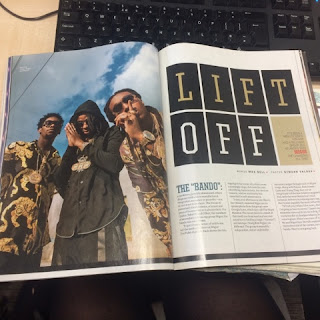
Double Page Spread
Stand First - A stand-first is that initial few lines you see in magazines and web pages that stand out. It is normally in a different font to the rest of the text to make it eye-catching and is usually in a less formal tone to attract the reader by making them feel like the article is tailored to them. It is acceptable for music magazines to use informal language because their audience is interested in the music and details about it.
Featured artist - The name of the featured artist is usually in very large writing, and acts like a second headline. The font is usually different and it can be in a different colour, making it stand out from the rest of the article. The featured artist is mentioned because it gives the reader the name of the artist and if the artist is well known, it makes the magazine more appealing.
Drop Capital - A drop capital is usually a lot bigger font than the rest of the text and can be a different colour or font. A drop capital is used at the beginning of the article (the first letter) because it stands out to let the reader know where to start writing. This is helpful because sometimes the paragraphs in an article are placed where its hard to tell which is the first one and so a drop capital shows the reader which the first paragraph is.
Sub-headings - Subheadings are usually slightly larger than the rest of the text and are mostly bold or in a different font. This makes the sub-heading stand out from the section of writing. Sub-headings also make it easier to find a specific part of an article if you only wanted to read a small amount of it/find a specific detail. In this case the sub-headings also help the article seem more authentic as they are influenced by the Ten Commandments and therefore the headings bring the article together.
Main Image - A double page spread usually has a main image which is large, taking up almost half of the page. This helps divide the writing into smaller, more manageable sections to read. In this DPS the main image is centralised and is a medium shot. In the image the artist is doing a pose which is seen often in hip-hop, complimenting the strap line describing her as 'the Queen of Hip-Hop'.
Quotations - A quote is usually embedded in the article which ahs been said by the featured artist. The quote is usually something important/interesting which the artist has said to make the reader want to read the whole article. The quote is usually highlighted and in a bigger font than the rest of the text to make it stand out. They would also use a quote because it makes the reader feel like the artist is more involved in the article.
Mise-en-scene - The text on the page is arranged so it wraps around the artist's body. The artist is wearing animal print which is seen regularly in hip-hop and the outfit is mainly black and white because these colours fit the colour scheme. the small amounts of colour on her jewellery makes the image stand out more because it is the only colour on the page which isn't pink, black or white. Going with the colour scheme, the artist is wearing pink lipstick which is a similar colour to the back ground, bringing the whole page together.
Headline - The headline is usually at the top of the page and is normally a lot bigger than the rest of the text, in a different font and sometimes a different colour. The headline is always short and snappy, capturing the most interesting parts of the article, engaging the reader. The headline tells the audience what the story is about.
LIIAR Analysis
Language -
Media language is used to portray the codes and conventions in which makes something a good media text. This is shown through the conventions such as the masthead, main image and the feature stories etc.
Institution -
Rolling Stone is a biweekly magazine which focuses on popular culture. I have chosen to look at the magazine Rolling Stone in further detail in my LIIAR analysis because it is a magazine which features music from almost all genres and as I haven't decided on a fine genre, it thought this was the best magazine to analyse.
Ideology -
I think the ideology of Rolling Stone magazine is to be a popular and respected magazine which focuses on music and bands from all different genres. The magazine looks at music which is popular on a large scale, and also looks at bands and artists which are older and respected but which are still popular and possibly making an appearance again.
Audience -
The magazine was first known for its musical coverage and for political reporting. In the 1990s, the magazine focused on a younger readership interested in youth-oriented television shows, film actors, and popular music. In recent years, the magazine has resumed its traditional mix of content and therefore a mix of readers.
Representation -
The cover of Rolling Stone is represented as a general music magazine. It follows all of the codes and conventions which a music magazine generally follows. The magazine has an iconic mast head which is well known worldwide meaning the simple design represents the magazine in a way which is effective for its purpose.
Conventions Analysis of a Double Page Spread
Conventions analysis of a DPS of a music magazine. LIIAR to be applied
and each area to be explained in detail.


Conventions Analysis of Contents Page
Conventions analysis of a contents page of a music magazine. LIIAR to be
applied and each area to be explained in detail.


Conventions Analysis of Front Cover
Conventions analysis of a front cover of a music magazine. LIIAR to be
applied and each area to be explained in detail.


Foundation Portfolio Brief
My foundation portfolio brief is to design a front cover, contents page and double page spread for a brand new music magazine. I will look at a variety of existing music magazines and from this, gather a knowledge of the common conventions needed to make my magazine look professional and yet individual.
I will hopefully create a realistic looking music magazine with an enticing name and a recognisable house style which is reflected throughout. I will also make sure all of my images and text are original and will use a minimum of 4 images.
I will hopefully create a realistic looking music magazine with an enticing name and a recognisable house style which is reflected throughout. I will also make sure all of my images and text are original and will use a minimum of 4 images.
EVALUATION QUESTIONS
Over the
past few weeks I have designed and constructed a college magazine cover and
contents page. To prepare for this task I set up a blog where I displayed: the
brief; a LIIAR analysis; conventions research; a mood board; a digital draft;
name ideas; colour schemes; feature story ideas; camera framings; a selection
of photographs for the front cover and print screens of the designing and
creating of the product.
WHAT HAVE
YOU LEARNED
From
completing this task I have learnt the basics of how to use Photoshop, what is
effective and what engages the audience when it comes to magazine covers. I
have learned about specific colours which complement each other to make a text
more interesting and eye-catching and I have also learned lots of new media
terminology.
HOW HAVE YOU
USED TECHNOLOGY
To complete
this task I have had to use a wide range of technology. I have used the
internet to set up a blog on blogger.com, I have used a memory stick to
transport my work to and from school, I have used a camera to take photographs
and I have used Photoshop to edit and alter images.
WHAT
CONVENTIONS HAVE YOU USED AND WHY
To produce
my magazine cover I have used many different conventions to make it look as
realistic as possible. I have used a masthead to draw the attention of the
audience, I have used a main mage and a main feature story to show the audience
what my magazine is about, I have used a barcode and a price to replicate the
fact that the magazine would be sold in a shop and I have used a plug to
influence the reader to buy the magazine.
WHAT WOULD
YOU CHANGE IF YOU HAD TO DO IT AGAIN
If I was to
do the task again I would ask my model to wear a plain coloured shirt because
the checks on the shirt make some of the writing hard to read. I would also use
more colours to make it more eye catching as it is mainly black and white.
Subscribe to:
Comments (Atom)